GTA VI’s launch gallery: how light gives Vice City its shape
A spoiler-free visual analysis of the marina, nightlife and underwater imagery, with the original screenshots in context.
In this guide
GTA VI’s launch gallery is particularly revealing when viewed as a study in light. A bright marina, a crowded club and a road beneath evening signs organize attention in different ways. Their value is visible in the images themselves; there is no need to turn every object into a promised gameplay mechanic.
Rockstar published the launch gallery on November 5 and introduced it through Newswire. This is a spoiler-free look at selected environmental images. It examines composition and atmosphere, not story outcomes, map measurements or performance. The screenshots are promotional selections rather than an independent capture of the shipping game.
Daylight leaves fewer places to hide the scene
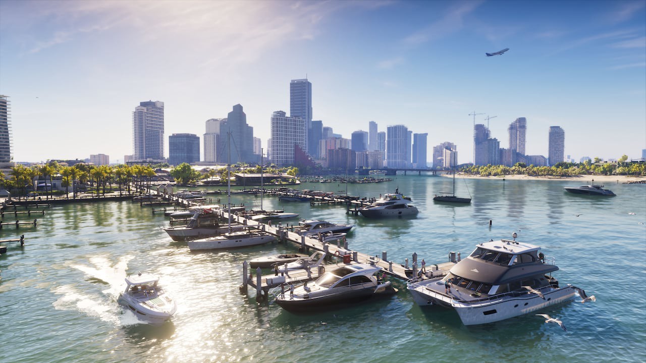
The Vice City marina image opens a broad view across water toward the skyline. White boats and bright reflections occupy the foreground; taller buildings form a more distant layer. The frame gives the eye several scales to read at once, from individual vessels to the city beyond them.
That arrangement makes the water do more than fill an empty foreground. Reflections break up the surface while preserving a visual route toward the buildings. Low structures and vegetation prevent the skyline from becoming a single hard edge. These are observations about the chosen image, not a measurement of the world’s navigable area.
Our earlier article on Leonida’s places considered the contrast between regions. Here, the narrower question is how one scene organizes its own depth. A world can feel extensive because a composition makes distances legible, even before anyone calculates a map’s dimensions.
Night uses colour to divide the frame
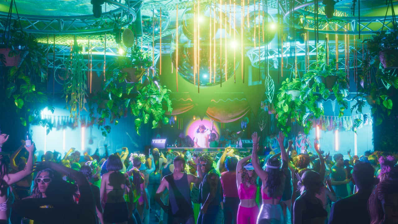
The club screenshot takes almost the opposite approach. Green and cyan light dominate the upper space, with the crowd forming a denser lower layer. Bright fixtures establish the centre of attention, while individual figures become part of the scene’s rhythm rather than isolated portraits.
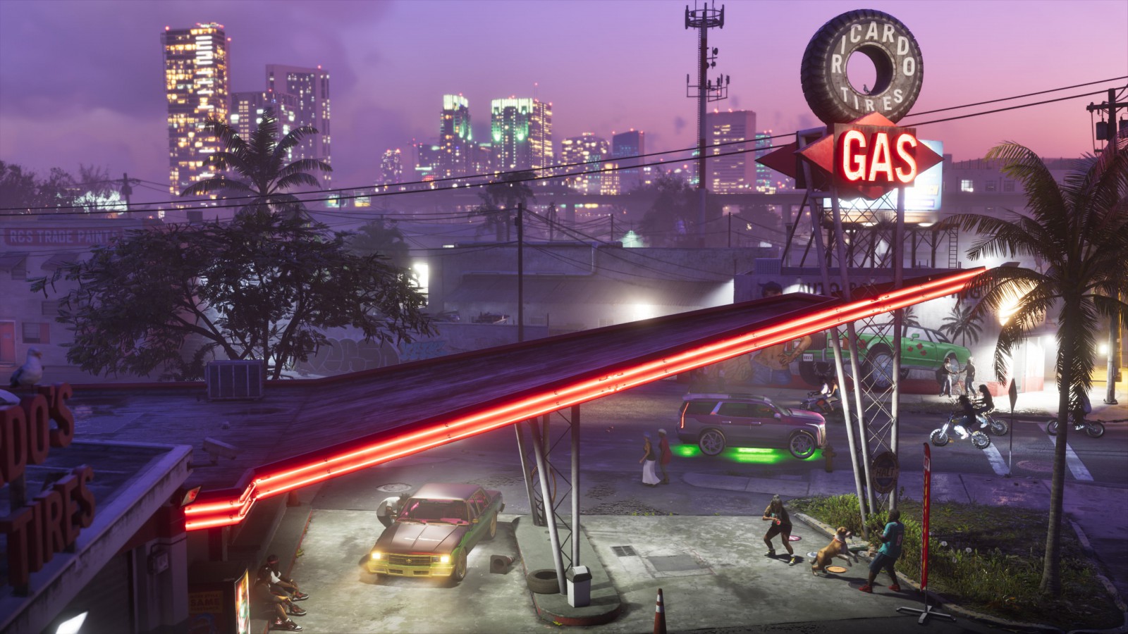
The road image with the illuminated gas sign is quieter but similarly selective. Warm signage and streaks of red light draw lines across a cooler evening background. The scene is readable through contrasts between small bright elements and larger dark areas, rather than through uniformly high brightness.
Neither image establishes a specific lighting technique. Reflections and shadows in a still do not prove that a particular ray-tracing option is enabled, identify the capture hardware or reveal how the effect holds up in motion. Those are technical questions requiring different evidence. Art direction remains discussable without pretending a screenshot is a benchmark.
Underwater, the silhouette becomes the guide
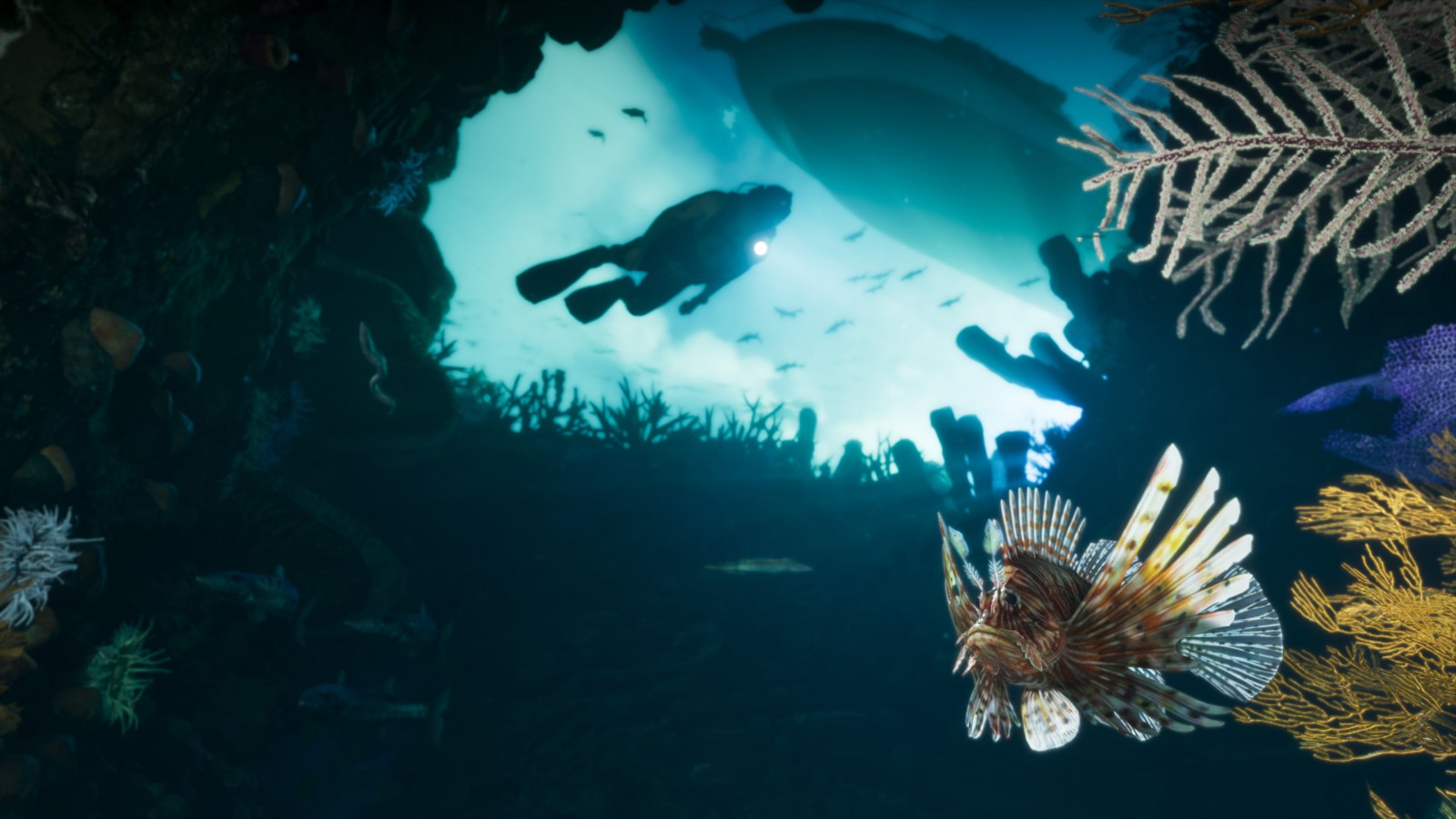
The Leonida Keys image places a diver against a brighter blue opening, with darker reef forms around the edges. A fish in the foreground adds another depth cue. The strongest shape is the diver’s silhouette: the body remains easy to pick out despite the busy natural detail.
That is a useful contrast with the marina. One frame opens the whole view under daylight; the other makes a smaller bright area carry the composition. The images suggest variety in how the world is presented, without supplying evidence for a particular diving activity, equipment system or mission.
Looking at these scenes together reveals a more interesting visual question than whether every surface is maximally sharp. Can the world direct attention while preserving the feeling of a busy place? A still can show the intention. Only the playable game can establish how well that intention survives movement, camera control and a player looking somewhere the promotional composition did not anticipate.
This gallery offers a reason to look more closely at its image-making: Vice City is not lit with one permanent sunset. Its character changes with the relationship between the brightest thing in the frame and everything allowed to remain in shadow.