Wolverine’s Photo Mode works best when every light has a job
A spoiler-free guide to framing, selective lighting and choosing a final image shape, using PlayStation’s published tools and portrait example.
Marvel's Wolverine gives players enough photographic controls to make a picture look very different from the moment that produced it. The useful starting point is restraint: decide what should attract the eye, then use the camera and lighting to make that decision visible. Five lights are available; five competing ideas are not required.
PlayStation's October 22 Photo Mode guide explains the tools in Insomniac's PS5 game. The linked guide includes outfit and story spoilers. This article keeps to camera and lighting techniques, with a neutral portrait rather than plot scenes or unlockable-costume reveals. The official game page confirms the PS5 release is available; this is guidance for its existing Photo Mode, not an announcement of a newly released mode.
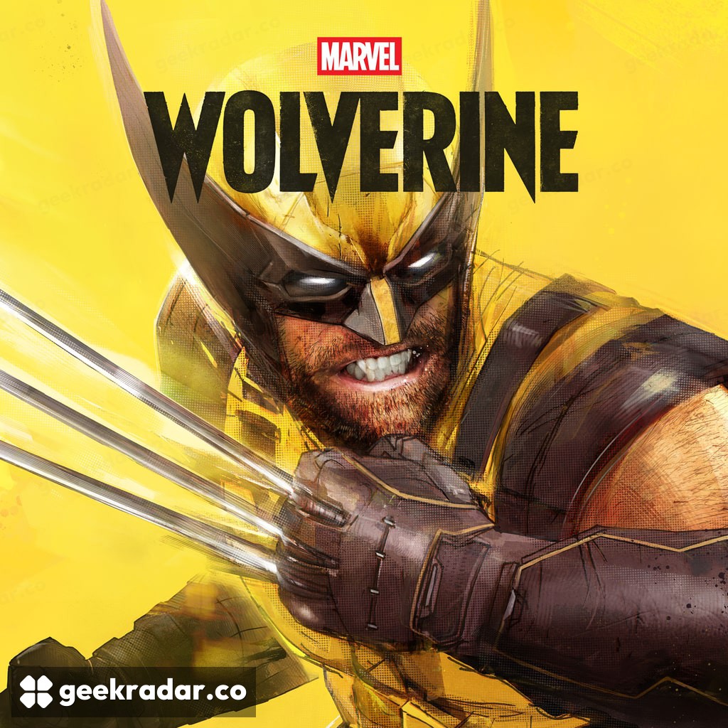
Cover artwork: PlayStation / Insomniac Games. © 2026 MARVEL.
Compose before adding effects
Begin with a simple subject and a background that does not compete with it. Move the camera until the outline of the head or shoulders is readable. A bright shape directly behind an eye, or an edge that seems to grow out of a head, can distract more than a technically imperfect texture. The first useful edit is often a change of viewpoint.
For a portrait, leave enough room in the direction the subject faces to make the framing feel intentional. A very tight crop can create tension; a wider one lets the environment contribute. Neither is automatically better. Choose the relationship first, then preserve it as you adjust the image.
The official guide notes that the Photo Mode interface can move between sides of the screen. Use that before making a composition worse just to work around the controls. It also describes a directional-pad shortcut and game-speed adjustments for catching a moment. Those controls reduce the friction of entering the mode; they do not decide which moment is worth keeping.
Give each light a job
The game offers five independently adjustable lights, with Sphere and Spotlight options. Instead of immediately filling the scene, start with one source and change its position. Watch what happens to the shape of the face and the boundary between subject and background. Adding brightness everywhere can make an image easier to see while making it less interesting to read.
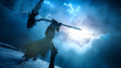
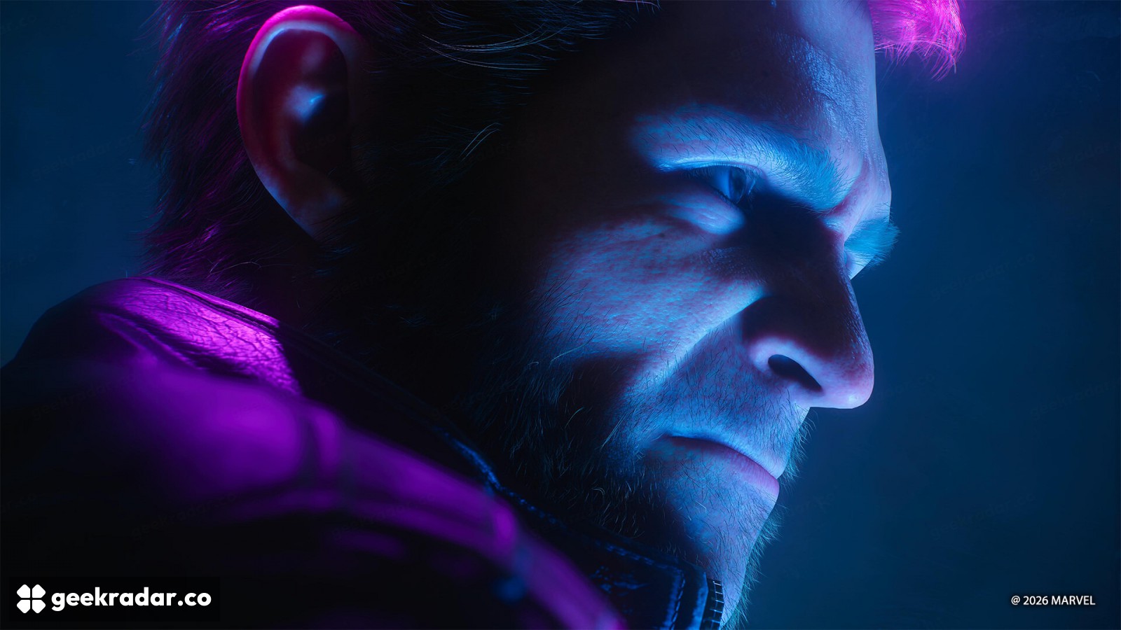
The portrait shown here, supplied with PlayStation's guide, makes the principle visible: contrasting colors give the face and the edge of the head different roles. You can follow the outline without losing the darker area that gives the face depth. It is an example of deliberate separation, not a requirement to make every image neon blue and pink.
Color is strongest when it has a reason. A warm subject against a cooler background can be legible; several equally saturated colors can compete. Keep checking the small version of the picture. If the face disappears when the image shrinks, extra detail will not rescue the composition.
Choose the final shape before the final crop
The guide's Tilt control can rotate a composition toward portrait orientation. Decide early whether the picture is for a wide screen or a tall phone display, because the useful empty space changes with the shape. Cropping a finished landscape image into a narrow rectangle can remove the very relationship that made it work.
Photo Mode permits a kind of authorship that ordinary screenshots do not: the player can turn a passing instant into a considered image. The strongest result need not advertise every available control. It can simply make one face, one shadow or one direction of light feel unmistakably chosen.