iPhone Duo’s app badge is a starting point, not the whole experience
Apple’s new showcase separates launch apps from updates still weeks away. The useful question is what each app does with the fold.
Apple is putting a “Made for iPhone Duo” badge on optimized apps and preparing dedicated App Store collections for Friday’s launch. Its October 22 showcase also makes something less obvious clear: not every experience in the presentation is arriving on the same day.
Word and Outlook adaptations are described as coming in the following weeks; Zenless Zone Zero’s Duo update is due next month. The badge is a useful discovery aid, but an app’s actual version and release status remain more informative than its presence in a launch announcement.
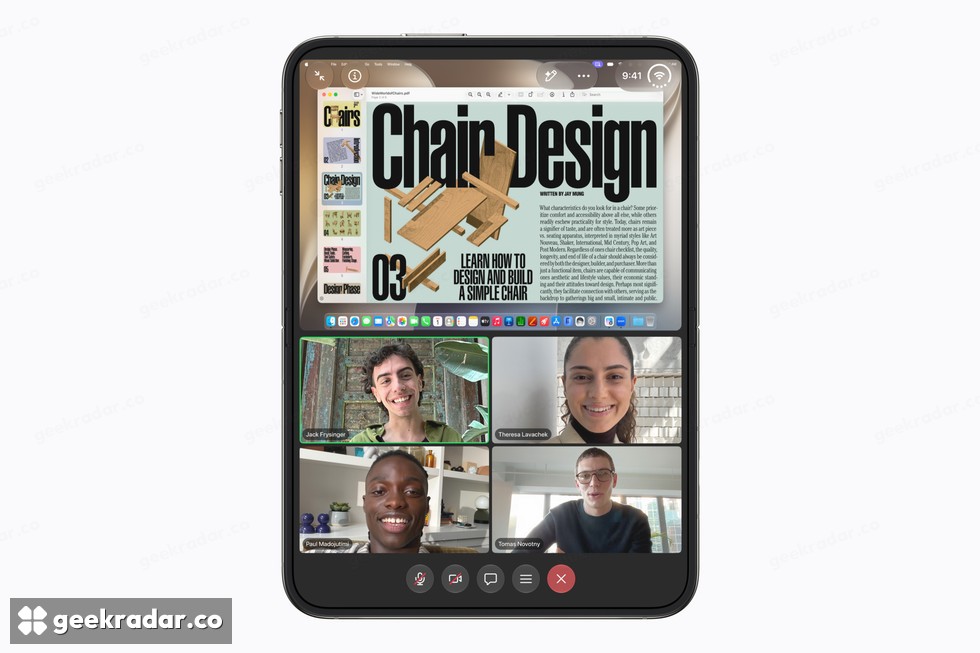
More room can mean fewer interruptions
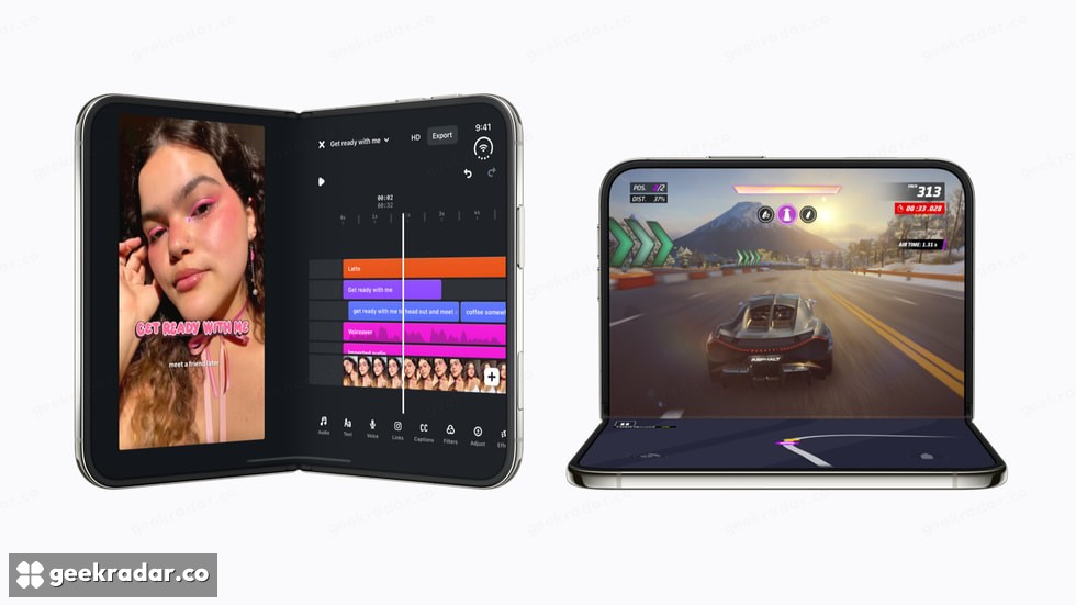
The strongest examples make two related things visible at once. Zoom shows shared material alongside participants. In a document editor, keeping formatting controls beside the page can reduce the need to repeatedly open and dismiss a panel. The benefit is continuity: the information you need to make a decision stays in view while you act on it.
That differs from simply enlarging every element. A larger button is sometimes helpful, but it does not by itself make a complex task easier. An app designed for the extra space can change which parts of a workflow fit together, rather than only how large the same screen appears.
Apple’s original hardware announcement provides the multitasking baseline. Neither approach automatically replaces a laptop: text entry, file handling and the depth of the app’s functions still matter. But they can remove specific interruptions from a task that already works on a phone.
The hinge is an interface decision
The partially folded position creates a second design opportunity. A video can occupy one half while contextual information or controls sit on the other. That is useful when the division follows the task. It is less useful if the fold simply reduces the picture without giving the lower half a clear purpose.
Apple’s examples include Prime Video separating playback from X-Ray information. That describes an interface arrangement, not a guarantee that every title or feature is available in every country. Italian viewers still need the relevant service subscription and local catalog; a phone’s capabilities do not change distribution rights.
The same reasoning applies to games. Controls that adapt to how the device is held may be more important than a larger view alone. Whether the result is comfortable over a long session requires actual use, not a judgment drawn from promotional screenshots.
Check the app you depend on
Apple’s developer guidance explains the submission and screenshot support behind the new device. This is a continuing software transition, not a claim that every existing app has already been redesigned.
Our launch availability coverage addresses when the hardware reaches buyers. The software question is narrower and more personal: does the app you use every day preserve your place when the device opens, and does it put something genuinely useful in the extra space?
A badge can help locate candidates. The real payoff is the moment you stop closing one panel merely to remember what was behind it.
Product and interface images: Apple.