One UI 9 Watch reaches Galaxy Watch8: the useful upgrade is easier information at a glance
Samsung's Korean firmware log confirms a specific build. The interface changes are clearer than the claims of universal rollout.
One UI 9 Watch is reaching the Galaxy Watch8 generation, and Samsung's firmware record provides a firmer starting point than a blanket “available worldwide” claim. The company's Korean log for the 44mm LTE model, SM-L335N, lists build L335NKOU3BZJ7, released November 9, with One UI 9 Watch, AndroidWear 7.0 and an October 5 security patch level.
That official device log confirms a specific release for a specific model and market. It does not establish that every Watch8, every carrier or every country receives the same build at the same time. The more durable story is what the update changes when it reaches the watch: less friction in configuring the small screen, and a clearer hierarchy for information viewed in brief glances.
A circular screen needs more than smaller phone menus
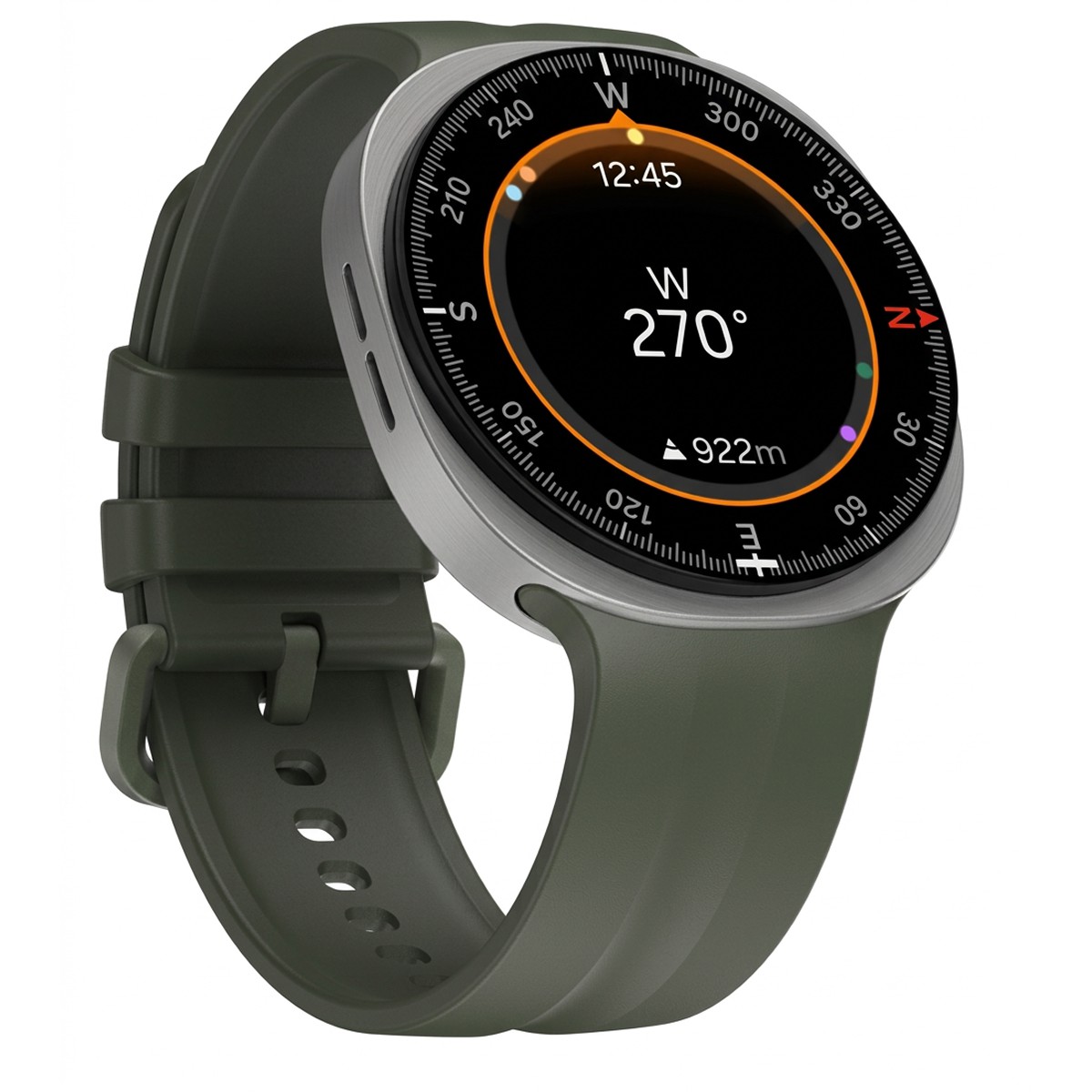
Samsung's One UI 9 Watch design explanation, published in September, describes an interface organized around the circular display. The compass uses a radial layout, while health information combines shape, color and hierarchy to make status easier to recognize. The responsive layout also adapts to font size rather than treating larger text as something that simply has to be squeezed into the same space.
That is a meaningful design problem on a watch. A notification can contain the correct information and still be frustrating if the important part requires another tap or is truncated at the edge. Larger type helps only if the surrounding layout gives it room. The update's value is therefore better assessed through the readability of ordinary interactions than through the number of new screens in a promotional gallery.
The Korean release notes describe a simpler notification layout and tiles that adjust when the text size changes. They also describe a revised Galaxy Wearable settings screen on the phone, with a larger watch preview and easier access to frequently used controls.
Watch-face editing gets a clearer division
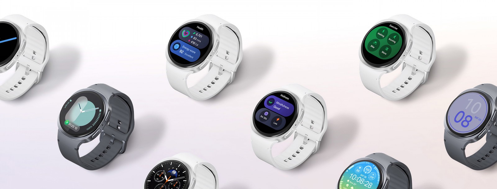
The update separates watch-face editing into style and complication tabs. Complications are the small information areas that can display items such as battery status, weather or activity. Keeping those choices apart from the face's visual style can make it easier to change the information without losing the appearance already chosen.
Samsung also describes larger previews and swiping through alternative colors and styles. These are modest changes, but they affect a recurring task: finding a face that looks right and then making it show the things that matter during the day. Reducing menu depth is useful when customization otherwise feels more laborious than leaving the default alone.
Health presentation and health measurement are different
The release notes include redesigned health charts, a consistent color system, more detailed mobile-app views and workout controls using the back button. They also list daily aerobic-load information and overnight vital-sign summaries for the documented device configuration.
The visual redesign should not be confused with proof of greater sensor accuracy or a medical diagnosis. A clearer chart can make existing information easier to interpret without changing how accurately it was measured. Samsung's design images illustrate the interface across its watch family; they are not evidence that every pictured feature or hardware configuration has been added to every older model.
For Galaxy Watch8 owners, the sensible check is the update offered to their actual watch, followed by the functions they use most: notifications, workout controls and the face's information areas. A software generation matters when it makes a familiar device easier to live with. On a screen this small, saving a tap or preserving a readable line can be more valuable than adding another feature that remains buried in a menu.