Wear OS 8 wants the system to own the clock at the top of your apps
Google’s emulator preview standardizes time and status information, with new spacing and scrolling rules for watch apps.
Wear OS is preparing to take responsibility for the small clock at the top of watch apps. Google's developer documentation for the new system status bar describes a platform-controlled area at twelve o'clock that combines the time with a priority status indicator. The practical aim is consistency: an app should not have to recreate basic system information each time you open it.
This is a developer preview, not an update arriving on watches today. Google places the eventual feature in Wear OS 8, while making it available for experimental testing in the Wear OS 7.1 Beta Preview Emulator, API 37.2-beta1. Those names describe different stages of the same work; the emulator version is not proof of a consumer rollout.
Who owns the top of the screen?
Through Wear OS 7, apps could draw their own content across the whole display. A clock built with the TimeText component, a curved heading or a control could occupy the top edge. With the new status bar, the operating system claims that space for a consistent clock and system state.
Only one status icon appears at a time, selected by priority. Google gives examples including microphone or location use, connectivity and battery information. This matters because a tiny circular display cannot accommodate an indefinitely expanding row of indicators. The system has to choose what deserves the limited space rather than leave each app to invent a different answer.
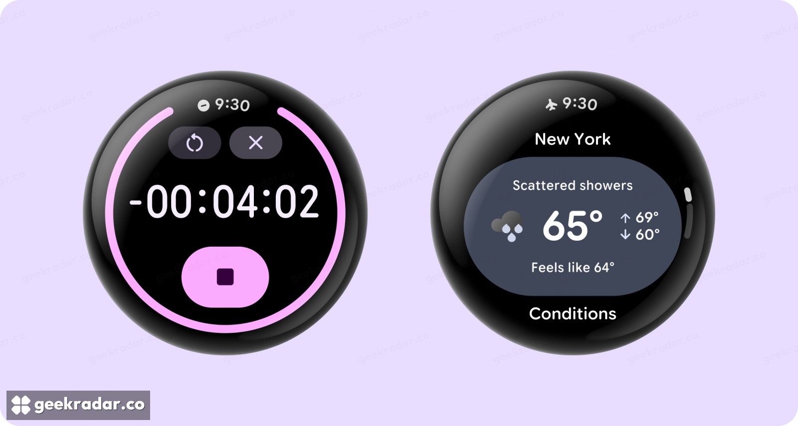
Google's preview images show the same time position above two very different screens: a timer and weather information. The useful change is the persistence of that visual convention. A reader can learn where to look without treating every app as a new watch face.
Consistency has a space cost
Reserving the top edge reduces the area an app can use freely. On a round display, that is also where the available width narrows. Simply drawing the new bar over an existing interface could leave a title, button or second clock competing for the same pixels.
The preview therefore coordinates the system bar with app layout. Google's Wear Compose 1.8 components, including AppScaffold and ScreenScaffold, handle the relevant spacing and clock behaviour. Developers using older approaches or Android Views need to account for the new area explicitly. Supporting a new system clock also means retaining an appropriate in-app clock on older operating systems that do not supply one.
The Wear Compose release notes show the work extending beyond a new clock. Version 1.8.0-alpha02 adds a way to suppress the system bar around a screen while resetting its top padding. That pairing is important: removing an overlay without reclaiming its space would leave an unexplained gap in the interface.
A small visual change with a migration behind it
For users, the desired result is uncomplicated: the time appears once, important status information has a familiar position, and controls remain accessible. For app developers, that requires checking transitions, scrolling, dialogs and full-screen content, rather than merely adding another component.
Google has not supplied a physical-device rollout date or an eligibility list in this documentation. It is too early to attach the feature to a particular existing watch. What is already clear is the design tradeoff: Wear OS is asking apps to surrender a little freedom at the top of the screen so that the person wearing the watch has one less interface convention to relearn.