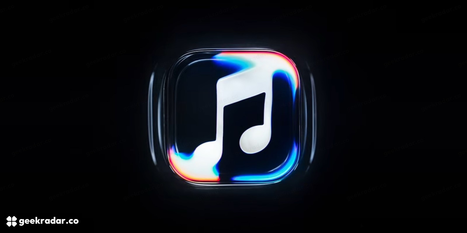
Apple Music’s new identity starts with sound moving liquid
Fred again.. and NEST Acoustics helped create the composition behind a visual identity captured through a physical process.
Apple Music’s new visual identity started with a physical experiment: play sound through a rig, move liquid and film the resulting shapes. The October 21 reveal gives the service a new look built around an original composition by Fred again.. and NEST Acoustics. It also gives a familiar music-note mark a more interesting origin story than another simulated glass surface.
In Apple Music’s behind-the-scenes film, the team describes sending frequencies through a rig and using the movement they produce as visual material. Apple says the work was captured in camera. That claim concerns how the identity was made; it does not mean the app itself now turns every song into a live liquid visualizer.
Sound supplies the movement
The short film is worth watching for the relationship between the equipment and the imagery. At roughly 18 seconds, the explanation moves from choosing a frequency to playing it through the rig; the following section describes moving a substantial volume of liquid. The music is therefore an input to a physical process, rather than merely a soundtrack added to an unrelated animation.
Apple’s announcement on its official Music account names Fred again.. and NEST Acoustics as collaborators on the composition. The film connects that work with a final sonic signature: the notes help define both what the brand sounds like and the visual response associated with it.
That is the most distinctive part of the project. A waveform on a screen is already a familiar way to represent sound. Here the frequency passes through a material with its own movement and surface behavior. The resulting image has a connection to the audio even when the viewer does not know the apparatus behind it.
A moving identity still has to work as a small icon
The imagery accompanying the reveal keeps the music-note symbol readable while surrounding it with a dark, fluid surface and bright edges. 9to5Mac’s report on the rebrand shows the new treatment and discusses its application to the app identity.
There are two different jobs here. A launch film can depend on motion, scale and sound to explain an idea. A phone icon has to survive a glance between dozens of other apps. Keeping the recognizable note gives the identity a fixed point while its surrounding treatment changes. Whether the moving material is beautiful is only part of the design question; whether the service remains easy to find is the everyday one.
This announcement also needs to stay in its proper category. It establishes a change in presentation, not a new audio codec, a larger catalogue or a documented improvement in playback fidelity. A new surface can communicate musical character without altering the sound delivered to a listener’s headphones.
For more on the distinction between what a service presents and what it tells listeners about their music, our coverage of YouTube Music’s AI labels examines a different use of interface identity: identifying the material being played. Both belong to the broader music experience, but solve different problems.
Apple Music’s strongest design decision is the connection between the medium and the message. A service built around listening has used listening’s raw material to generate something visible. The icon must still do the ordinary work of being recognized quickly; the physical process gives that ordinary mark a story worth telling.
Image: Apple Music, via 9to5Mac.