How a game-show typeface became the lettering GTA VI kept
Rockstar’s New York office chose Pricedown without knowing who drew it. The type designer was already working for the company in Toronto.
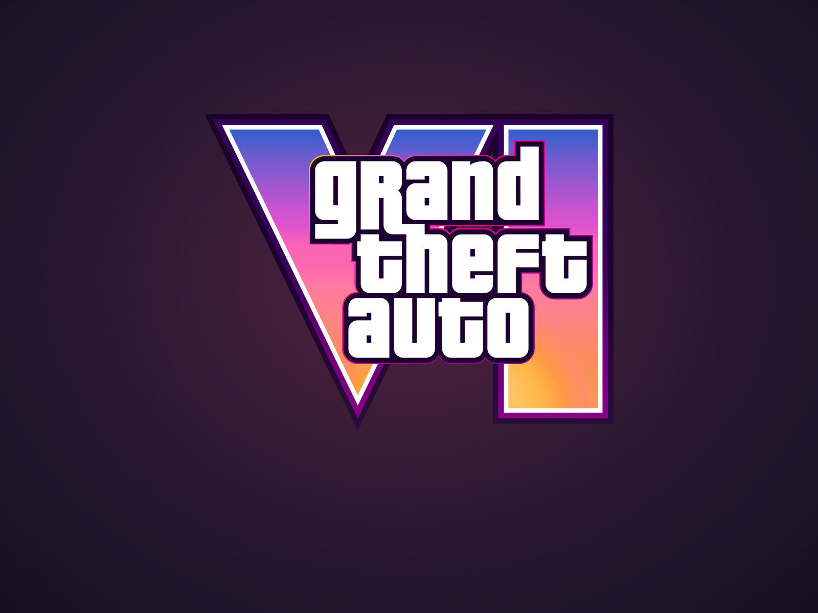
The most familiar part of the Grand Theft Auto VI logo nearly hides the new part. Three lines of white lettering sit across the Roman numeral, interrupting its sweep from violet to orange. Cover the numeral and the words still announce the series. Their distinctive shapes come from Pricedown, a typeface whose designer had a television game show in mind.
Stuart Petri, Rockstar’s vice president of art for 2D and interface design, names Pricedown among the elements the studio wanted to keep as it rebuilt Vice City. His development notes, reported by Inven Global, put a typeface in the same company as the wanted stars and the Wasted screen. The story of how Rockstar acquired that visual signature has a surprising detail. The man who drew the letters was already on the payroll, in an entirely different office.
From the game-show stage to Rockstar Toronto
In his history of Pricedown, type designer Raymond Larabie traces its shapes to Pinto Flare, an early-1970s display face, and the lettering of The Price Is Right. Even his font’s name borrows from the show and its Showcase Showdown. He kept the squared forms and the strokes that curl underneath neighbouring letters, sharpening the corners in his version.
Larabie recalls working as an art director at Rockstar Toronto when the New York office picked his freely available font. The people who chose it had no idea a colleague had made it. Larabie himself didn’t work on the title that made his lettering famous. What looks today like an unusually successful commission started with someone in another city finding the right font.
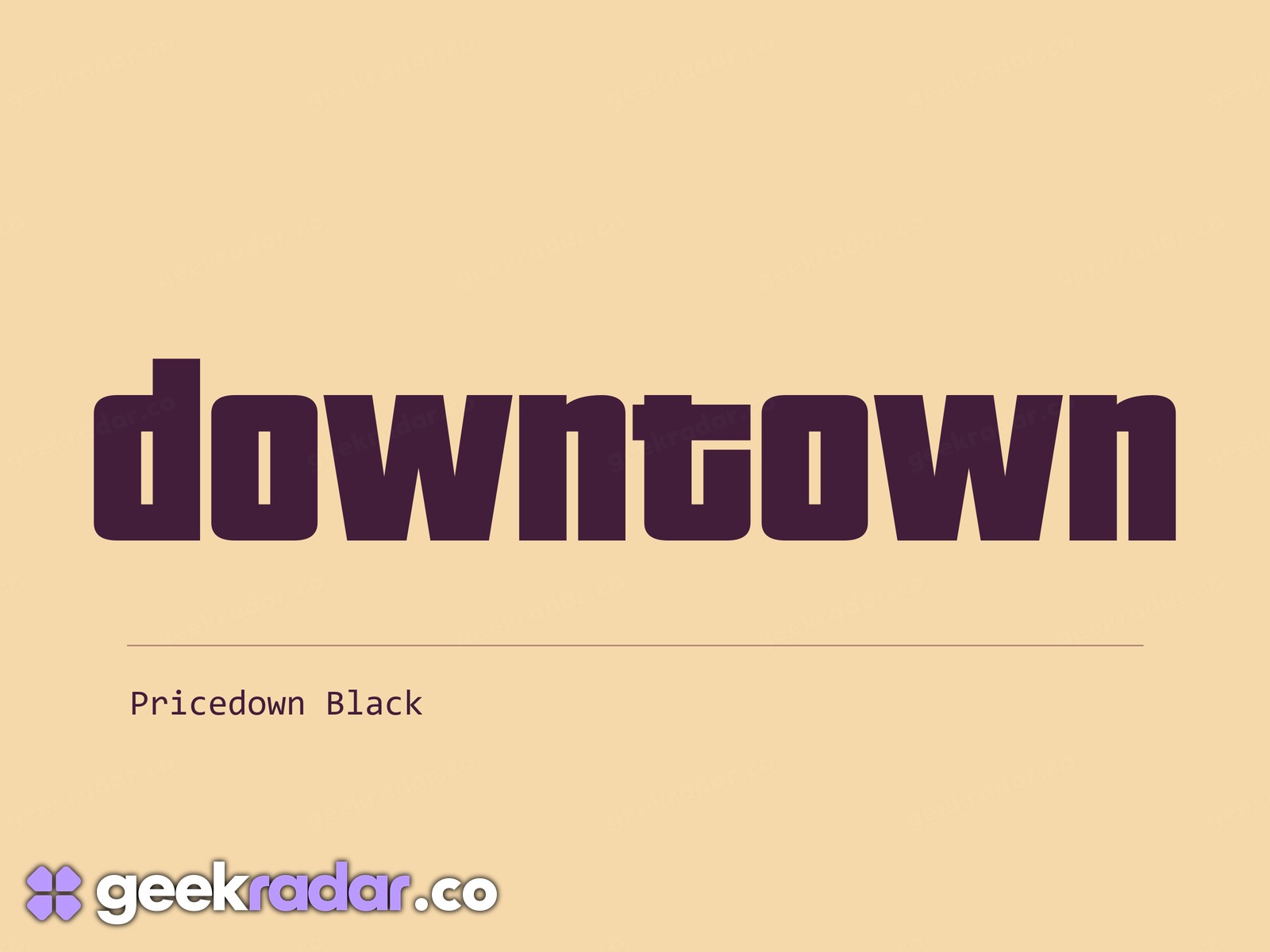
Read the holes in the letters
Look at the two o’s in the downtown specimen. Inside each is a narrow upright slot. The outer corner has a slight curve, but most of the letter is made of straight strokes. The d has a similar interior and a tall stem. Even without the black outline, stacked words or sunset colours of the game logo, the eye has something familiar to catch. The specimen uses Pricedown Black, the name the original heavy style acquired as the family grew to nine weights.
The distinction between typeface and finished logo is easiest to see on Rockstar’s printable cover poster. Pricedown supplies a vocabulary of letter shapes. Choosing where theft ends relative to grand, how much dark outline separates the rows and how the white block crosses the coloured numeral gives this particular title its silhouette.
Petri describes a different job for the interface during play. Information should be available when the player asks for it and recede when attention returns to the world. The title has the opposite assignment. On a crowded poster or a small store tile, those three white rows have only an instant to tell you which game you’re looking at. A typeface once drawn with a game show in mind can still do that before you even read the VI.